http://www.flickr.com/photos/zoeradford/8683834567/in/photostream/
Showing posts with label Research. Show all posts
Monday, 15 April 2013
Analysis of NME double page spread (Jake Bugg)
http://www.flickr.com/photos/zoeradford/8683834567/in/photostream/
Sunday, 14 April 2013
Analysis of NME double page spreads (Libertines)
Click the link below for my analysis of this contents page on Flickr.Hover over the image to view my analysis of each feature.
Wednesday, 10 April 2013
Analysis of NME contents page (Jake Bugg issue)
http://www.flickr.com/photos/zoeradford/8684838752/in/photostream/
Analysis of NME contents page (Libertines)
http://www.flickr.com/photos/zoeradford/8683719533/in/photostream/
Friday, 5 April 2013
Analysis of NME cover (Libertines edition)
http://www.flickr.com/photos/zoeradford/8684901074/in/photostream/
Wednesday, 3 April 2013
Analysis of NME cover (Jake Bugg issue)
http://www.flickr.com/photos/zoeradford/8684903232/in/photostream/
Tuesday, 2 April 2013
Pigeons & Peacocks - indie fashion magazine inspiration
Because I am interested in fashion, photography and graphic design as well as music, I am always on the lookout for independent magazines that feature these topics. I managed to find a completely independent fashion magazine called 'Pigeons & Peacocks' which was actually published by London College of Fashion in collaboration with the students, staff, graduates and the fashion industry. It's only on it's 5th issue, and I bought it because of the completely unique look to it - it was unlike anything I'd ever seen before.
Unlike most magazines, it has no cover lines at all, and challenges the conventions of most common magazines in general. The actual material it's made from is almost as thick as card, and the photography within it is very editorial. The gold masthead and tagline 'A Fashion Magazine for the Post Apocalyptic Blues' stand out from the block black background, and the image of the model Jade Thompson (winner of Britain's Next Top Model 2011) endorses the front cover. The image is very striking, and this is what drew me in to buy it. I want to use a striking image for this reason - to attract the audience and make them want to buy the magazine and read the articles inside.
This double page spread was also something I looked at. I really liked the hot pink colour used in this article, the images used and the unusual spacious layout. The colour scheme on this page reinforces the female audience and the images would definitely attract the photography lovers within the audience. Also, the topic of tumblr would be very appealing to a younger audience, which is one that I would be aiming for too. As with the pink on the Vogue front covers, I think I will definitely use a shade of pink within my house style to connote the female audience. Throughout the magazine, there are many interesting double page spreads and photo shoots that I looked at.
The photography on these pages (the editing, positioning and the colours within the images) are all so eye catching, and the layout of the pages are also very appealing to an audience which would be interested in design. The indie style to this magazine is something that definitely attracts me, so within my own work, I also hope to produce something which I would buy myself. I will be taking into consideration all of the features of Pigeons & Peacocks, Vogue, and NME when creating my own magazine.
Sunday, 31 March 2013
Vogue - August issue analysis
I looked into last year's August issue for inspiration in closer detail.
In this issue, the actress Emma Stone is the main focus, taking up the cover and the main double page spreads. Here, Alexa Chung (a famous style icon, model and journalist) has an interview with her - her style of writing is very descriptive which is a quality I really like. This is apparent in the pull quote 'Stone is the cool, quirky girl from school; the one you'd sit next to , hoping you'd become cooler via osmosis.' I like this interview, and due to the fact that 55% of the people I asked in my questionnaire said they'd prefer an interview to other articles such as a review, I will try to create something similar for the article of my on double page spread. Similar to NME, the image of Emma Stone takes up the whole of one of the pages of the spread, and this seems to be a reoccurring theme across many different type of magazine. As I mentioned before, the pink colouring on the cover of this issue is a detail that I find very appealing, as my audience is going to be mainly girls.
As well as the Emma Stone double page spread, I also looked at the images that were taken for another article in the same issue with the model Lindsay Wixon.
I loved these images, as they show the youth and feminine side of the model. This are connotations that I wish to convey through my on photographs, and so I want to use these as inspiration for my own. I love the use of props (they drink and the ice cream) and also the use of black and white.
As you can see from this double page spread, similar to the Emma Stone pages, the image takes up a whole page, and the article takes up the other. I like the layout of the article here too - the 3 columns of text, drop cap, kicker and the title of the page come together to create a neat and professional looking double page spread.
Saturday, 30 March 2013
Fashion magazine inspiration - Vogue
As well as looking at NME for my inspiration, I also looked at other magazines from different genres, not just music. I decided that because my magazine is going to be aimed at mainly girls, who also have an interest in fashion I should look at the conventions of Vogue, an extremely popular and established fashion magazine. Over the past few years, I have bought many issues of Vogue and I keep these along with my issues of NME. Here are some photographs that I took of a few of the issues I own.
As you can see from these covers, the main image is just a single mid/ mid close up of the model and the colour scheme, as with NME changes for each issue. I particularly like the pink colouring on the two issues, as it stands out to the reader and has connotations of a female orientation. This may be something I consider for the colour scheme of my own magazine. Also, the bar code is always in the right hand corner, again, similar to NME. I also like the cartoon font that is used on the third cover - it looks handwritten and glossy, and the colours of the font also have feminine connotations. I will definitely consider the conventions of Vogue when producing my own magazine, as the audience (females who are also interested in fashion) would be similar to my own.
Thursday, 21 March 2013
Mood board of the Indie Genre
This is a mood board of things to do with the 'indie' genre of music I have made, including bands and artists, lyrics from songs and even some of the artistic side of the genre (such as album covers and typography). I have also included small things which give an idea of the type of style that an indie musician/ artist may wear in relation to the type of magazine I want to create, for example, the three girls from the indie girl band 'Haim' (the black and white photo near the centre of the mood board) - their dress sense will be something I consider when deciding on what clothes I would like the people in the 'band' I create for my magazine to wear.
Friday, 8 March 2013
Media Theory - Male Gaze Theory, Star Theory and Moral Panic Theory
Laura Mulvey's Male Gaze theory
Today, many feminists would see most media output as a product of a male dominated order. In 1975 Laura Mulvey, a British feminist film theorist, created the 'Male Gaze theory'. She stated the cinema audiences look at films in 2 ways; voyeuristically and fetishistically. In turn, this leads to 2 side effects; the 'objectification of females' and the 'narcissistic identification' of the ideal image on the screen. Her theory confirmed that the media was created for the satisfaction of males, with women merely being 'objects of desire for their visual pleasure'.
Richard Dyer's Star Theory
Richard Dyer noted that a star is just an image created for audiences, not a real person - they are commodities produced and consumed on the strength of their meanings. The 'star image' is based on 2 paradoxes; they must be both ordinary and extraordinary, and they must be simultaneously present and absent.
Cohen's Moral Panic theory
In this theory, Cohen says that within the media, certain groups of people are portrayed as a threat to society by people in power (such as the government), and this is played on, causing a moral panic among the public. The panic among the public turn them against the certain groups of people, turning them into 'folk devils'. Major examples of this is seen today within the media, where newspapers have turned many British people against immigrants, and turned many Westerners against Muslim countries and all people who live in them.
Saturday, 9 February 2013
Second analysis of school newsletter - St. James' Catholic High School
I looked at a second newsletter from a different high school, this time from St. James' Catholic High school in Cheshire. The target audience is made clear from the outset with the start of the letter reading, 'Dear Parents/ Carers'. I am not as familiar with this high school as with my own, but from looking at the school's website, there seems to be no correlation between the school's colour scheme and the colour scheme of the newsletter. The school's website is predominantly navy blue, gold and white with black text, whereas the newsletter is mainly white with many different coloured text boxes (red and green text boxes and even pink and purple text as seen below).
The beginning of the newsletter is quite formal, with a letter from the headteacher, followed by a prayer (which is clearly a large part of their Catholic school life). This part of the newsletter is suited to the audience of the parents, as it is informative and it is laid out very formally. However, this newsletter was clearly published on Microsoft Publisher/ Word, as the text boxes are very cartoon like. As well as this, there are different fonts used in different text boxes, which is not professional looking at all as you can see in the screen shots below.
There are some photographs, however they are not taken with a professional camera, and so they don't look as professional. These type of images are clearly common across all school newsletters. Again, this newsletter includes clip arts which look unprofessional.
Overall, I would say that this newsletter meets its target audience well with the formality of the letter from the head which actually addresses the parents/ carers, however there are some features which are quite unprofessional. I shall take these points into consideration when designing my own newsletter.
Saturday, 2 February 2013
My chosen genre
After consideration, I have decided to do an indie music magazine, as that is the type of music I am most interested in. This will help me to give a focus to my future research, and help me with my final production. I will look at indie genre magazines like Q and NME for inspiration and research as I am more familiar with the conventions of music magazines in this genre - I frequently buy NME and have many copies at home. These are some of the issues I have kept.
As you can see, they all have a similar layout, with one main image, and on some issues, there are some small thumbnails. The masthead 'NME' is always the same size and font as you would expect, however they are often different colours which contrast with the background, but compliment the colour scheme of the particular edition. On each of the covers, there are no more than 4 colours for text, and there are always one or more plugs to entice the reader to buy it. I really like this layout, and I have also looked at the contents pages and double page spreads of some of these issues.
Thursday, 31 January 2013
Analysis of the Deyes school newsletter
For our prelim task, we have been asked to produce a school news letter, so in lesson we decided to look at our own school newsletter for Deyes high and analyse it. The target audience of the newsletter may be the students of Deyes, however, it is more likely to be aimed their parents, although due to the mixed content, this is slightly unclear. The colour scheme is quite effective, as they match the colours on our school badge/ logo, however, they are very bright primary colours, and this can sometimes look a bit unprofessional and have connotations of an almost childlike feel.
Also, the use of clip arts may be considered as an immature choice of imagery. Half way through the newsletter, there are some professional photographs of the drama students, and these work very well, as they promote the subject well and show that the school is professional.
The pages that include 'numeracy top tips' and 'puzzle time' are clearly aimed at the students, but, with their use of clip arts such as mickey mouse, the students may feel a bit patronised, as mickey mouse is clearly associated with younger children. Overall this newsletter is clearly not produced by professionals, and has a mixed target audience, which is made obvious by their use of formal and informal content.
Also, the use of clip arts may be considered as an immature choice of imagery. Half way through the newsletter, there are some professional photographs of the drama students, and these work very well, as they promote the subject well and show that the school is professional.
The letter from the head also suits its target audience, as the use of plain black text in a formal, paragraphed layout looks more mature. However, over the middle spread of pages ('recall to central') there is a lot of text, and many people (especially the students) would be bored with reading such large amounts of text. These pages are clearly aimed at parents, but even parents could potentially be bored with this.
The pages that include 'numeracy top tips' and 'puzzle time' are clearly aimed at the students, but, with their use of clip arts such as mickey mouse, the students may feel a bit patronised, as mickey mouse is clearly associated with younger children. Overall this newsletter is clearly not produced by professionals, and has a mixed target audience, which is made obvious by their use of formal and informal content.
Wednesday, 30 January 2013
Questionnaires
For my research into music magazines, I have decided to create a questionnaire which will allow me to identify my target audience and also indicate things that I need to consider when creating my own magazine. To create the questionnaire, I used Google docs (which is from the same family as Google Blogger), and this allowed me to share it on the Internet, which today may prove very effective as most people now have access to a computer. This means that I can get a lot of results easily and quickly. With the results I will be able to have a view into what people think about music magazines such as how much they are willing to pay for it, what sections of a magazine they are most interested in etc - these things will be necessary considerations when it comes to designing my own. I decided to have a maximum of 6 questions to a page, as from previous experience from filling out questionnaires myself, I find that too many qiestions to a page may put people off from continuing to fill out the rest of the form. Below is the link to my music questionnaire, please fill it out if you have time, as it only takes a minute to complete, thank you.
https://docs.google.com/spreadsheet/viewform?formkey=dFNpNFhhU0dWVzQ5UEQ5SlVXMmZselE6MQ#gid=0
Tuesday, 29 January 2013
Semiotics
Semiotics is the study of signs. A sign is something that stands for something, other than itself.
There are two main approaches to semiotics;
- the Ferdinand de Saussure approach (1857-1913)
- or the Charles Sander Pierce approach (1839-1914)
The first, is based on a study by Saussure - Sausuure's dyadic semiotic system. He concluded that signs are purely psychological and that they only make sense in a formal abstract system. He also stated that a one word language is an impossibility, and that a sign refers to what it is not. A sign is made up of a signifier, which signifies the signified - basically, something which connotes something else.
The other is Pierce's tryadic semiotic system, which states that there are 3 main different types of sign; indexes, icons and symbols. With indexes, the signifier is not arbitrary, but is connected to the signified in some way, either physically or casually (eg. the smell of smoke signifies a fire, but does not necessarily indicate a fire). An icon means that the signifier resembles the signified, for example a painting of a tree resembles a tree, but is not a tree itself, and a symbol is when the signifier is totally arbitrary and conventional, such as letters and numbers.
When making my magazine, I will have to consider the semiotics within it very carefully, in order to attract my target audience. I will take into consideration the colours I use for fonts and backgrounds, the images I use, and even the mise en scene within my photographs, as the wrong use of these things could have a poor end result - if my magazine was of the thrash metal genre, I would not use a pink and purple colour scheme to attract my hard core rock fans! I will have to keep my audience in mind, and use semiotics to ensure that my target audience would be attracted.
Saturday, 26 January 2013
Photoshop Editing
Due to the fact that we will need to use photoshop to edit photographs for our music magazine, during our lesson, we had a go at using some of the editing tools to crop photos, increase/ decrease the contrast/ brightness, and use the spot heal and clone stamp tools. Below are some examples of the originals and the edits.
As you can see, I used the crop tool to crop this image to get rid of unwanted and unnecessary background - this edit allowed me to make the image more focused to the object (in this case the planes).
For this photograph, I decreased the colour curves, which decreased the brightness of the image ( the top is the edit of the original below it).
On this photograph I used the Polygonal Lasso tool to select the area in the mirror, and then I selected the inverse and turned that black and white. This is a colour burst technique.
On this image, I used the spot healing tool to erase the spots off of the Dalmatian's face and shoulders.
For this photograph I used the clone stamp to take a section of the background and print it in front of the bottles. To make this look more realistic, I had to take sections of the background from a variety of different places.
Overall, these photoshop lessons were very helpful, as these techniques will be necessary in order for our magazine to look professional. I found the clone stamping the most difficult, as it was hard to get the background not to look fake, but when it's done really well it is a very effective editing technique which will potentially be used in the production of my music magazine. Also, I think that the spot healing will be very useful in editing the shots that I need to take of 'bands', as airbrushing is very common in the magazine industry in general, in order to make them look flawless.
Monday, 21 January 2013
Mock ups and conventions
In lesson we looked at several different examples of magazines. We looked at the layout of them, and created mock ups to help us notice some similarities that were common over all genres of magazine. I looked at an issue of the film magazine 'Empire' and the technology magazine 'Stuff'.
This mock up is of an issue of 'Stuff' magazine. Again, the masthead, although large is over layed with the image of a woman and the man, which shows it is also very recognisble and well known. A more simple colour scheme is used on this cover, with only red, black and white being used draws more attention to the images that have been used. This magazine is definitely aimed at men - the main image of a woman holding a piece of technology definitely would attract a man, and in this case, the use of the woman is very effective.
This is a mock up from a hobbit edition of Empire - it featured a main image of Bilbo and Golem, which clearly linked to the main article within this issue of the magazine. All text was in capitals and even the text in the plug was in capitals. Obviously the typical conventions of every magazine, including a bar code and a mast head were main features on the cover, and a colour scheme of black, gold for the mast head, red for the main title and white for tag lines and cover lines made sure that this issue was specified as being a special edition (the denotations of gold and red both have connotations of importance and ensure that the reader know that the Hobbit edition is a special one). This was very effective for this issue, as the Hobbit is a very popular franchise, and this cover will draw in many fans mainly through the effective use of imagery. We can see that Empire is a very popular magazine, as the image overlays the masthead - this shows that it is so well known, that it does not even need to be fully visible for it to be recognisable.
This mock up is of an issue of 'Stuff' magazine. Again, the masthead, although large is over layed with the image of a woman and the man, which shows it is also very recognisble and well known. A more simple colour scheme is used on this cover, with only red, black and white being used draws more attention to the images that have been used. This magazine is definitely aimed at men - the main image of a woman holding a piece of technology definitely would attract a man, and in this case, the use of the woman is very effective.
Friday, 18 January 2013
Music magazine research
I decided to do some initial research into music magazines. There are many different genres of music, therefore there are many different genres of music magazines, so has provided me with an array of different magazines to look at.
This is an example of a cover from NME - a music magazine which primarily focuses on the indie music genre. Personally, this is my favourite music genre. As you can see, this magazine tends to have a central image (in this issue, of 'The Last Shadow Puppets' Alex Turner and Miles Kane) surrounded by text. A simple colour sheme of red, white and black is used, and it is very effective, as it clearly seperates the titles from the subtitles etc. The colour scheme also contrasts, but also compliments the background image, so it draws the cover together very well as a whole. A small bit of yellow is also used in the plug, which is effective, as it stands out from the rest of the text.
This is a cover from Kerrang! music magazine. This magazine is more based around heavier rock music than NME, featuring bands/artists such as Metallica, Biffy Cliro and American alternative rock bands such as You Me At Six and My Chemical Romance. In contrast to the NME magazine, Kerrang! has several other smaller images which accompany the main image.
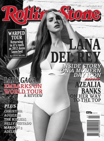
Rolling Stone is a very mixed bag, with many features from various genres - the first image featuring more pop type artists such as Lana Del Ray, Lady Gaga and Azelia Banks, and the second featuring an article on Pink Floyd and The White Stripes, two very famous rock bands. Obviously, some music magazines are successful without having a definite genre. Again, similar to NME Rolling Stone features a singular image surrounded by text.
Vibe magazine on the other hand has a very clear genre - R&B and rap music. This cover features Kanye West, a very famous rap artist. Like Rolling Stone and NME, this magazine has a single, central image.
Subscribe to:
Posts (Atom)