Wednesday, 27 February 2013

Photo shoot for Prelim task

A few days earlier, I organised an hour slot for me to take some photographs around school for my prelim school magazine. I used my shot list that I had made as it gave me a frame to base my shots around. I asked some students from lower down the school in year 9 and asked them to fill out a release form in order for me to take photographs of them, and then took them to classrooms that I had made sure were free the previous week. All together I took 58 photos with my own camera, and i managed to get some decent ines that I will be able to use for the magazine.
I got some shots of the students in several different locations, and then got some shots of the front of the school. As you can see, some of the photos did not turn out quite right, either being too bright/ dark, not being in focus, being blurred due to movement etc. In some of the classrooms there was also an insufficient amount of light, meaning I could not get the right exposure. I may also get a few more photographs on a different photo shoot, just to get a few more shots that I did not have time to take previously. 

Sunday, 24 February 2013

Photoshoot shot lists

These are some shot lists I made previous to the photo shoot I took for my school magazine. I have added annotations which describe the shots, and also explain why these shots would fit in with my ideologies that I want my school magazine to convey.

Tuesday, 19 February 2013

Newsletter mockups


This is an initial mockup of my prelim task newsletter that I created in Microsoft Publisher. I still need to consider what features I want to include within it (so I can add the cover lines) and I need to think of what headline I want to include. I will also think about possible colour schemes and images I will use.

I have decided to include an image of a year 9 student taking part in a science experiment, as it backs up my ideology that Deyes is a traditional school, with traditional values (that students are academic and happy). I will use my own camera for this, and I will use my younger sister as a model for this photograph. Hopefully I can get a professional looking image, which will take up the whole background of the cover, as it would do on typical magazine. I have also used the masthead 'Deyes News' - I may change this in the future, but I think this simplistic title will be more professional than perhaps a typical 'cringey' one (such as a play on words with the word 'Deyes' as in our actual school newsletter here at Deyes - 'Deyes of our Lives'). I will also use the school logo on the cover, which will help with my colour scheme. The school badge is red, black, white and blue, however, the colours are very vibrant. I may tone down these colours, as I have previously seen on the two newsletters that I have analysed, bright primary colours can make a newsletter look a bit immature and unprofessional.


This is my mockup of the contents page of my newsletter.

Sunday, 17 February 2013

Contributor Release Forms for Prelim School Magazine

These are the release forms that I got my models to fill out for permission for me to take photographs of them for my preliminary task.

Friday, 15 February 2013

Concert Photographs for my music magazine

As well as going to the NME awards tour on the 13th of February, I also went to see indie singer/ songwriter Jake Bugg at the Manchester academy on the 14th of February. Again, I took this as an opportunity to take photographs for my magazine. I was extremely lucky to get very close to the barrier at this concert, which allowed me to get some decent shots.
This is my ticket from the night. 
Because I was moving about quite a lot, and it was quite dark, most of my photos were quite blurred, but as with the photographs from the NME awards tour, I will edit them before putting them into my magazine. 

Thursday, 14 February 2013

Concert photographs for my music magazine

Last night, I was lucky enough to go to the NME Awards tour (which I also went to last year) and I took many photos which I intend to use within my music magazine. Most music magazines have images of bands/ artists playing their music, so this opportunity has been really good for me to take photographs which I can use. Bands like Peace, Palma Violets and Miles Kane played, and I managed to get some good shots. 
This is the poster advertising the event.
 This is also my ticket from the night. 
Obviously, when I come to decide which ones to include in my magazine, I will have to edit them accordingly.

Ideologies - the Preliminary task

In media, ideologies are sets of beliefs that are presented within a piece of media. When making my school newsletter, I will need to consider what things I want to represent through my use of images, text, font and even things such as colour schemes. I started to think about what ideologies I wanted to present, and how I could achieve this through the newsletter.

One of the main ideologies that I wanted to convey, was that Deyes is a traditional school, with traditional values, and to do this, I have decided that I should use images of parts of the school that look traditional, such as the red brick, ivy covered Lydiate building at the front of the school. Not only is it traditional looking, but it also the main building at the front of the school, and it is the first building that visitors see when coming into the school. It is the image that people already associate with Deyes, and it is recognisable, as well as being obviously traditional. Also, by using a mature colour scheme and fonts, this will show that Deyes is a professional establishment, who wants to be traditional.

Another ideology that I wanted to present was that Deyes High cares about its pupils, and wants to make sure that the students have the best school experience that they can have. To do this, I will use images of happy looking pupils, who look like they are enjoying their time in school, and I will focus the newsletter mainly on the students, and their achievements. This will show that Deyes wants to make their success the focus of their publications.

An ideology that is usually represented in many newsletters is that the teachers within the school strive to go 'above and beyond' to do all they can for their students. To do this in my newsletter, I may include an image of a teacher helping a pupil. Another main feature/ ideology of the school, is that academically, Deyes High School has recently had some of the best exam results so far, and that students who go to Deyes will achieve well throughout thier school life.

Saturday, 9 February 2013

Second analysis of school newsletter - St. James' Catholic High School

I looked at a second newsletter from a different high school, this time from St. James' Catholic High school in Cheshire. The target audience is made clear from the outset with the start of the letter reading, 'Dear Parents/ Carers'. I am not as familiar with this high school as with my own, but from looking at the school's website, there seems to be no correlation between the school's colour scheme and the colour scheme of the newsletter. The school's website is predominantly navy blue, gold and white with black text, whereas the newsletter is mainly white with many different coloured text boxes (red and green text boxes and even pink and purple text as seen below).
The beginning of the newsletter is quite formal, with a letter from the headteacher, followed by a prayer (which is clearly a large part of their Catholic school life). This part of the newsletter is suited to the audience of the parents, as it is informative and it is laid out very formally. However, this newsletter was clearly published on Microsoft Publisher/ Word, as the text boxes are very cartoon like. As well as this, there are different fonts used in different text boxes, which is not professional looking at all as you can see in the screen shots below.
There are some photographs, however they are not taken with a professional camera, and so they don't look as professional. These type of images are clearly common across all school newsletters. Again, this newsletter includes clip arts which look unprofessional.
Overall, I would say that this newsletter meets its target audience well with the formality of the letter from the head which actually addresses the parents/ carers, however there are some features which are quite unprofessional. I shall take these points into consideration when designing my own newsletter.

Monday, 4 February 2013

Prelim task: Initial ideas

When producing my own newsletter, I need to take many things into consideration in order to successfully cater for my target audience. Previously, I looked at my own schools newsletter and analysed its use of colour, font, images etc. I concluded that it was not very good at hitting its target audience, and this is something that I need to improve upon when making my own.

First, I need to decide on who I want my target audience to be, and from this I can work on how formal I want it to be, what images/ fonts I should use and the colour scheme and content. I think it may be best to aim  a school newsletter at parents, as from my own experience I know that students are probably not going to want to read their own schools newsletter, as they probably are already aware of what goes on/ what is happening in their school in the near future (they will probably be more interested in the pictures of class mates featured in the articles rather than the articles themselves!).

Due to the fact that the newsletter will be for the parents, the colour scheme also needs to be mature, but it also needs to relate to the school/ badge colour theme - as I saw in the Deyes newsletter, their colour scheme was a bit too vibrant to be taken seriously by adults. I think a more toned down colour scheme should be used with darker colours, rather than primary colours (which are often used in things with a younger audience as they have connotations of younger children).

As well as the colour scheme, I think more professional looking images should be used rather than the clip arts that were used in the Deyes newsletter. Although the clip arts were immature and aimed at a younger audience, the photographs that were used for the article on dance were very professional looking, and I hope to include some images which look as professional as that in my own production. I will need to look around school for suitable photographs that I could take to male this as professional as possible, and some images will be necessary for it to look like a proper school newsletter, for example a photograph of the outside of the school, a photograph of some students taking part in some school activity etc.

The fonts I use should also be professional - no comic sans as it is too unprofessional/ informal and no new times roman as it may be too formal. A font which is formal, but readable should be used, which will promote the schools professionalism.

Saturday, 2 February 2013

My chosen genre

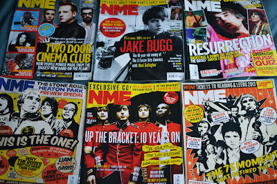
After consideration, I have decided to do an indie music magazine, as that is the type of music I am most interested in. This will help me to give a focus to my future research, and help me with my final production. I will look at indie genre magazines like Q and NME for inspiration and research as I am more familiar with the conventions of music magazines in this genre - I frequently buy NME and have many copies at home. These are some of the issues I have kept.
As you can see, they all have a similar layout, with one main image, and on some issues, there are some small thumbnails. The masthead 'NME' is always the same size and font as you would expect, however they are often different colours which contrast with the background, but compliment the colour scheme of the particular edition. On each of the covers, there are no more than 4 colours for text, and there are always one or more plugs to entice the reader to buy it. I really like this layout, and I have also looked at the contents pages and double page spreads of some of these issues.