Showing posts with label Analysis. Show all posts

Saturday, 20 April 2013

Double Page Spread Flat Plan

I decided to use an image which covered the whole of the right hand side of the page. From my research, I found that on a lot of double page spreads, a photo does take up a whole page, or even one and a half pages. However, I think my photograph would fit better on just one page, as if it went over the gutter, it could potentially cut off an essential part of the image (such as the models face). The image is one of the main focuses of the spread, and so, this is why I have decided to make it a dominant feature. 

I placed the title of the spread at the top left hand corner of the page, and I made it quite large, as again, from my research, it has become apparent that a large title is used to capture the reader's attention, which I intend to do here on my own double page spread. The title will have the largest font on the page, and this will  mean that it will be large enough to attract the reader's attention. 

Below my title, I want to place my kicker, which will give the reader a small introduction to the article, before they read on. This is a convention of all magazine articles, and so it was a necessity. I will use language which will make them want to carry on reading. 

From my research, I also found that captions that go with the images in the likes of NME tend to go right in the corner of the images, along with the page number, date and magazine title in the opposite corner.Within the article, I have also placed a pull quote. This is also a common convention of magazines, and I will use this to break up the main body of text, and also to entice the reader to read the article - the quote will be in a different colour, and will also have language in it that will pull the readers in (they'll have the shock factor). 

I have also used 3 columns of text for my article - this will make sure that the page doesn't look too crowded, as this may put the reader off (too much text may bore the reader). 

Friday, 19 April 2013

Contents Flat Plan

For my contents page, I looked at NME for my inspiration. I have used several images instead of overloading the page with text, as this may put the reader off. Several images will keep the reader interested, and will be more eye catching, making them want to turn the page.

 Instead of using the conventional title of 'Contents' for the title of my page, I swayed more in the direction of an NME style title by choosing 'This Week'. I have placed this at the top, and I want the font to be quite large to stand out to the reader. Because this is the contents page, I want to overlay the page numbers over the images in a colour that will contrast well will the background of all the images, to catch the reader's eye. I will use images that I have taken from the concerts I went to in February, and the photo shoot I had with Ellie which will link to the cover and double page spread. I will use this for my main image on the page. 

Thursday, 18 April 2013

Front Cover Flat Plan

This is my flat plan for my music magazine front cover. I took my inspiration for the layout from NME - I looked at several issues, and combined them to come up with this layout. I have used a banner across the top of the page as this was a very common feature across music magazines. I will make the banner have a ripped effect to connotate the main coverline (I have not decided on my main cover line yet, but it will have something to do with rebellion or chaos, which the ripped effect will connotate). 

I have also placed a boost on the left hand side of the page. This will promote another coverline, and will be slightly transparent (as this is an effect that I have also seen on issues of NME. This will be bigger than the smaller cover lines on the right of the page, suggesting that this is a very important feature in this issue. The main cover line will be a similar size to the masthead - this will show that this is the most important feature. I have tried not to over crowd the page with text, as for most covers of music magazines, the image is the main focus (as it will be for my own cover - the image is by far the biggest feature on the page showing its importance). This is because most people are actually drawn by images to magazines, rather than the text. 

Monday, 15 April 2013

Analysis of NME double page spread (Jake Bugg)

Click the link below for my analysis of this contents page on Flickr.Hover over the image to view my analysis of each feature.

http://www.flickr.com/photos/zoeradford/8683834567/in/photostream/

Sunday, 14 April 2013

Analysis of NME double page spreads (Libertines)

Click the link below for my analysis of this contents page on Flickr.Hover over the image to view my analysis of each feature.


Wednesday, 10 April 2013

Analysis of NME contents page (Jake Bugg issue)

Click the link below for my analysis of this contents page on Flickr.Hover over the image to view my analysis of each feature.

http://www.flickr.com/photos/zoeradford/8684838752/in/photostream/

Analysis of NME contents page (Libertines)

Click the link below for my analysis of this contents page on Flickr. Hover over the image to view my analysis of each feature.

http://www.flickr.com/photos/zoeradford/8683719533/in/photostream/


Friday, 5 April 2013

Analysis of NME cover (Libertines edition)

Click the link below for my analysis of this contents page on Flickr.Hover over the image to view my analysis of each feature.

http://www.flickr.com/photos/zoeradford/8684901074/in/photostream/

Wednesday, 3 April 2013

Analysis of NME cover (Jake Bugg issue)

Click the link below for my analysis of this contents page on Flickr.Hover over the image to view my analysis of each feature.

http://www.flickr.com/photos/zoeradford/8684903232/in/photostream/

Tuesday, 2 April 2013

Pigeons & Peacocks - indie fashion magazine inspiration

Because I am interested in fashion, photography and graphic design as well as music, I am always on the lookout for independent magazines that feature these topics. I managed to find a completely independent fashion magazine called 'Pigeons & Peacocks' which was actually published by London College of Fashion in collaboration with the students, staff, graduates and the fashion industry. It's only on it's 5th issue, and I bought it because of the completely unique look to it - it was unlike anything I'd ever seen before. 
Unlike most magazines, it has no cover lines at all, and challenges the conventions of most common magazines in general. The actual material it's made from is almost as thick as card, and the photography within it is very editorial. The gold masthead and tagline 'A Fashion Magazine for the Post Apocalyptic Blues' stand out from the block black background, and the image of the model Jade Thompson (winner of Britain's Next Top Model 2011) endorses the front cover. The image is very striking, and this is what drew me in to buy it. I want to use a striking image for this reason - to attract the audience and make them want to buy the magazine and read the articles inside. 
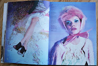
This double page spread was also something I looked at. I really liked the hot pink colour used in this article,  the images used and the unusual spacious layout. The colour scheme on this page reinforces the female audience and the images would definitely attract the photography lovers within the audience. Also, the topic of tumblr would be very appealing to a younger audience, which is one that I would be aiming for too. As with the pink on the Vogue front covers, I think I will definitely use a shade of pink within my house style to connote the female audience. Throughout the magazine, there are many interesting double page spreads and photo shoots that I looked at. 
The photography on these pages (the editing, positioning and the colours within the images) are all so eye catching, and the layout of the pages are also very appealing to an audience which would be interested in design. The indie style to this magazine is something that definitely attracts me, so within my own work, I also hope to produce something which I would buy myself. I will be taking into consideration all of the features of Pigeons & Peacocks, Vogue, and NME when creating my own magazine. 

Sunday, 31 March 2013

Vogue - August issue analysis

I looked into last year's August issue for inspiration in closer detail.  
In this issue, the actress Emma Stone is the main focus, taking up the cover and the main double page spreads. Here, Alexa Chung (a famous style icon, model and journalist) has an interview with her - her style of writing is very descriptive which is a quality I really like. This is apparent in the pull quote 'Stone is the cool, quirky girl from school; the one you'd sit next to , hoping you'd become cooler via osmosis.' I like this interview, and due to the fact that 55% of the people I asked in my questionnaire said they'd prefer an interview to other articles such as a review, I will try to create something similar for the article of my on double page spread. Similar to NME, the image of Emma Stone takes up the whole of one of the pages of the spread, and this seems to be a reoccurring theme across many different type of magazine. As I mentioned before, the pink colouring on the cover of this issue is a detail that I find very appealing, as my audience is going to be mainly girls. 

As well as the Emma Stone double page spread, I also looked at the images that were taken for another article in the same issue with the model Lindsay Wixon. 
I loved these images, as they show the youth and feminine side of the model. This are connotations that I wish to convey through my on photographs, and so I want to use these as inspiration for my own. I love the use of props (they drink and the ice cream) and also the use of black and white. 
As you can see from this double page spread, similar to the Emma Stone pages, the image takes up a whole page, and the article takes up the other. I like the layout of the article here too - the 3 columns of text, drop cap, kicker and the title of the page come together to create a neat and professional looking double page spread.

Saturday, 30 March 2013

Fashion magazine inspiration - Vogue

As well as looking at NME for my inspiration, I also looked at other magazines from different genres, not just music. I decided that because my magazine is going to be aimed at mainly girls, who also have an interest in fashion I should look at the conventions of Vogue, an extremely popular and established fashion magazine. Over the past few years, I have bought many issues of Vogue and I keep these along with my issues of NME. Here are some photographs that I took of a few of the issues I own. 
As you can see from these covers, the main image is just a single mid/ mid close up of the model and the colour scheme, as with NME changes for each issue. I particularly like the pink colouring on the two issues, as it stands out to the reader and has connotations of a female orientation. This may be something I consider for the colour scheme of my own magazine. Also, the bar code is always in the right hand corner, again, similar to NME. I also like the cartoon font that is used on the third cover - it looks handwritten and glossy, and the colours of the font also have feminine connotations. I will definitely consider the conventions of Vogue when producing my own magazine, as the audience (females who are also interested in fashion) would be similar to my own. 

Monday, 18 March 2013

Title Evalutions

I have narrowed it down to 3 possible titles; Charged, Lisztomania and Reckless. 

Charged - There are several connotations of the word 'Charged', including it being suggestive of electricity - an electric charge, which could be suggestive of an electric guitar. Indie music is very reliant on electric guitars, as they are one of the key instruments used in the genre. Using this as a title would conjure up that image which would be effective as the title of an indie magazine.

Lisztomania - I originally came across this word when I first started listening to the indie band 'Phoenix' as it is a title of one of their songs. I didn't really know what it meant, but I was curious, so I looked it up and came across an article in which the term 'Lisztomania' was described, "Lisztomania or Liszt fever was the intense fan frenzy directed toward Franz Liszt during his performances. This frenzy first occurred in Berlin in 1841 and the term was later coined by Heinrich Heine in a feuilleton he wrote on April 25, 1844, discussing the 1844 Parisian concert season. Lisztomania was characterized by intense levels of hysteria demonstrated by fans." I thought that this name was quite unusual, but quite appropriate, as if the target audience is as intended, they would be familiar with this word if they listen to Phoenix (as it could be quite confusing for someone who listens to rap music for example). As well, the fact that this word basically means fan hysteria, I thought it would be good for people who are very interested in bands that would be featured in my magazine (my target audience). 

Reckless - I looked through all the music on my phone for inspiration of titles that may have came from bands names, album titles or song names, and I quite liked the sound of 'Reckless Serenade' by Arctic Monkeys. I thought that the two words together may have been a bit long for a magazine title, and just the word 'Serenade' may have sounded a bit too classical to be the title of an Indie music magazine, so the word 'Reckless' seemed more appropriate. I think this title would be good for the heavier side of indie rock, such as if my magazine focused more on bands like Arctic Monkeys or The Libertines, due to the fact that 'Reckless' has connotations of a more manic music fan (and their music is definitely heavier than that of bands like Foals or Two Door Cinema Club). This may mean that I'd have to solely concentrate on bands which produce heavier music if I used this title.  

Saturday, 9 February 2013

Second analysis of school newsletter - St. James' Catholic High School

I looked at a second newsletter from a different high school, this time from St. James' Catholic High school in Cheshire. The target audience is made clear from the outset with the start of the letter reading, 'Dear Parents/ Carers'. I am not as familiar with this high school as with my own, but from looking at the school's website, there seems to be no correlation between the school's colour scheme and the colour scheme of the newsletter. The school's website is predominantly navy blue, gold and white with black text, whereas the newsletter is mainly white with many different coloured text boxes (red and green text boxes and even pink and purple text as seen below).
The beginning of the newsletter is quite formal, with a letter from the headteacher, followed by a prayer (which is clearly a large part of their Catholic school life). This part of the newsletter is suited to the audience of the parents, as it is informative and it is laid out very formally. However, this newsletter was clearly published on Microsoft Publisher/ Word, as the text boxes are very cartoon like. As well as this, there are different fonts used in different text boxes, which is not professional looking at all as you can see in the screen shots below.
There are some photographs, however they are not taken with a professional camera, and so they don't look as professional. These type of images are clearly common across all school newsletters. Again, this newsletter includes clip arts which look unprofessional.
Overall, I would say that this newsletter meets its target audience well with the formality of the letter from the head which actually addresses the parents/ carers, however there are some features which are quite unprofessional. I shall take these points into consideration when designing my own newsletter.

Thursday, 31 January 2013

Analysis of the Deyes school newsletter

For our prelim task, we have been asked to produce a school news letter, so in lesson we decided to look at our own school newsletter for Deyes high and analyse it. The target audience of the newsletter may be the students of Deyes, however, it is more likely to be aimed their parents, although due to the mixed content, this is slightly unclear. The colour scheme is quite effective, as they match the colours on our school badge/ logo, however, they are very bright primary colours, and this can sometimes look a bit unprofessional and have connotations of an almost childlike feel.
Also, the use of clip arts may be considered as an immature choice of imagery. Half way through the newsletter, there are some professional photographs of the drama students, and these work very well, as they promote the subject well and show that the school is professional.
The letter from the head also suits its target audience, as the use of plain black text in a formal, paragraphed layout looks more mature. However, over the middle spread of pages ('recall to central') there is a lot of text, and many people (especially the students) would be bored with reading such large amounts of text. These pages are clearly aimed at parents, but even parents could potentially be bored with this.


The pages that include 'numeracy top tips' and 'puzzle time' are clearly aimed at the students, but, with their use of clip arts such as mickey mouse, the students may feel a bit patronised, as mickey mouse is clearly associated with younger children. Overall this newsletter is clearly not produced by professionals, and has a mixed target audience, which is made obvious by their use of formal and informal content.